B2B Dealer Portal redesign
Role: Interface design, prototyping, accessibility check
Scope: Massive Interface redesign
Context
I worked within the UX and UI team to redesign the original digital ecosystem for Dealer Portal (fictional name, due to NDA). The client needed to migrate from an obsolete legacy architecture to a modern, user-centric platform, streamlining complex B2B processes, such as warranty claims, fleet monitoring, sales management, and a new product comparison feature.
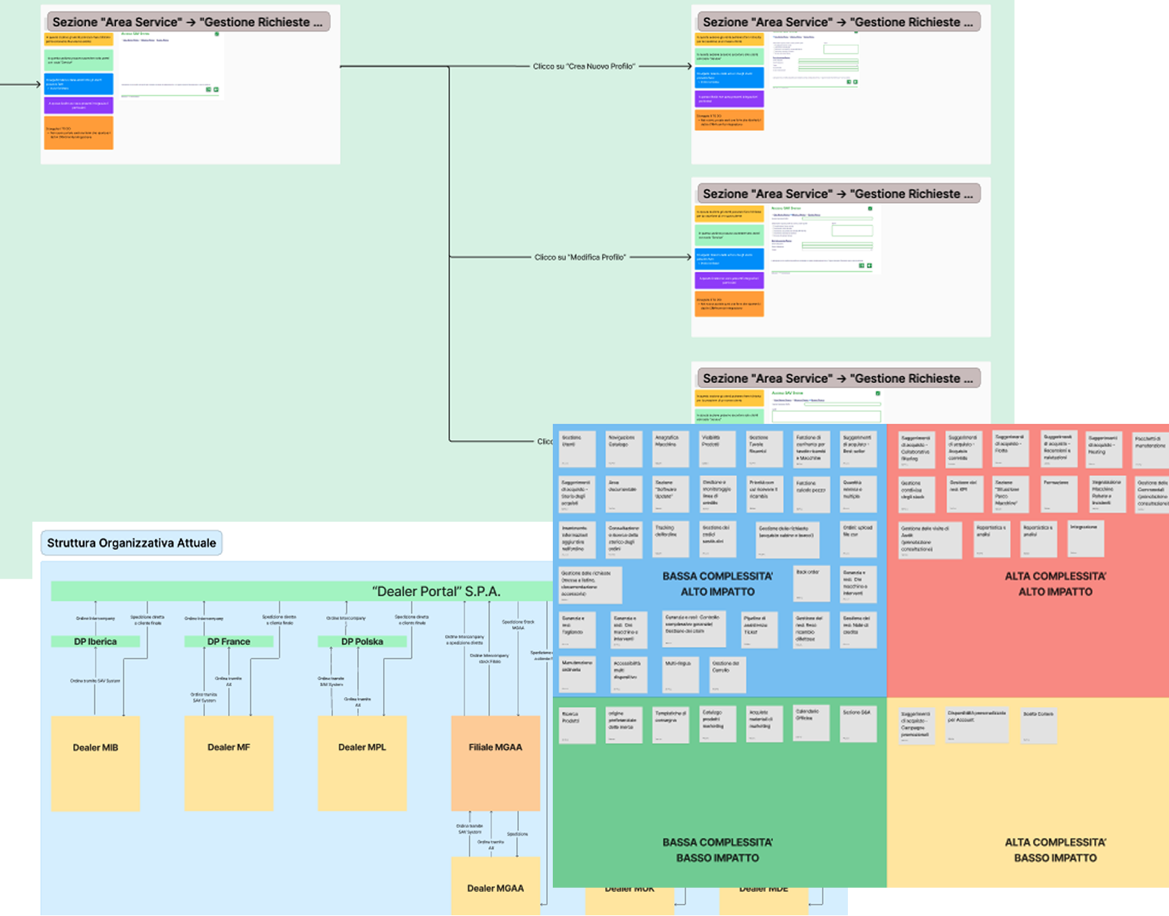
The main goal was to build a modern, ad-hoc Design System from scratch to ensure visual consistency and code-ready accessibility across the platform. We started from the as is system architecture analysis to then define the new architecture.
Design System and UI Overhaul
We approached the project by first establishing a modern, consistent, and scalable Design System. This "foundation-first" approach allowed us to create a custom visual language specifically tailored to meet strict accessibility standards from day one.
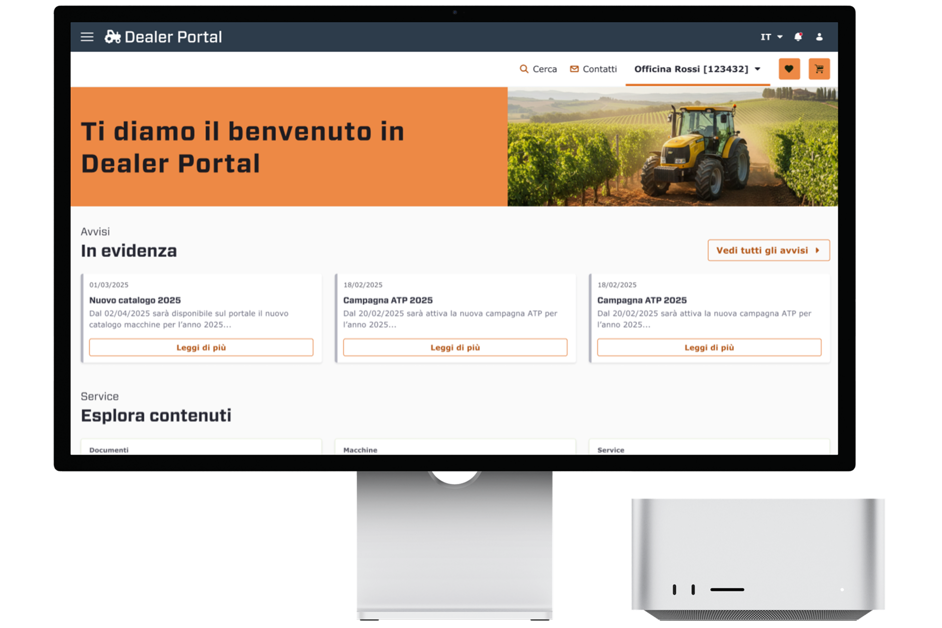
Translating the functional and technical analysis into high-fidelity designs, we completely rebuilt the Dealer Portal interface. The goal was to empower dealers to manage after-sales relationships and activities autonomously and efficiently. We streamlined complex interactions by improving UI patterns, strategically placing Call to Actions (CTAs), and optimizing user forms to maximize clarity and usability.
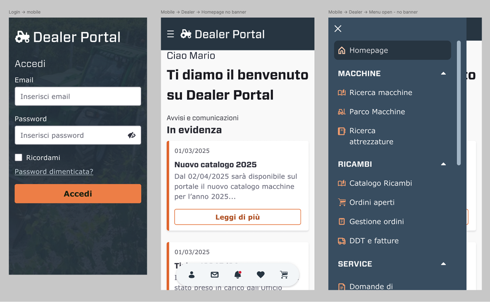
We also produced high fidelity wireframes for the main mobile pages, to help visualize the user paths on smaller screens and decide on the best solutions for huge table visualisation, or other responsive design considerations. For example, the user menu was arranged in fixed position, on the bottom.
Design System and UI Overhaul
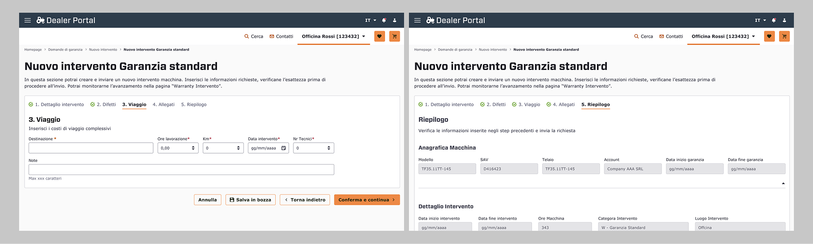
We developed a fully accessible Progress indicator component, to be added in those sections where the user is prompted to fill out a form, to send a request or to require data, or even to open a support ticket. In the example in the photo down below: the New intervening standard warranty form.
By breaking the form into logical sections (e.g., "Step 3: Viaggio"), we prevent Decision fatigue, by letting users see the relevant fields to the current context. This approach significantly reduces the mental effort required to complete the task. Also, the stepper acts as a map. Users know exactly where they are in the process, how many steps are missing and whether they have correctly filled in the previous steps, thanks to the status icons inside the step titles. This also improves navigation for users with cognitive or memory impairments.
The Stepper anatomy:
- The form is separated into digestible, and logical steps
- The action bar under the steps provides visual feedback about the "engines" for the stepper
- Status of each step is communicated through a combination of color, icons, and typography:
- Completed Steps - Indicated by a green palette and a checkmark icon, notifying "task complete"
- Active Step - Bold and black text, focusing the user's attention on the current task.
- Error State - Steps containing errors are highlighted with warning red icon
- Functional navigation and persistance:
- Confirm & Continue - as Primary action, it triggers real-time validation
- Back & Save Draft - is the essential action for easy corrections without data loss
- Save Draft - was introduces to respect the technical user's reality, where interruptions are common
Quick overview and core interactions
Value added
Impact of new design features:
- Refined Patterns: improved navigation to reduce friction
- Action-Oriented: clear and strategic CTAs to guide users
Before & after
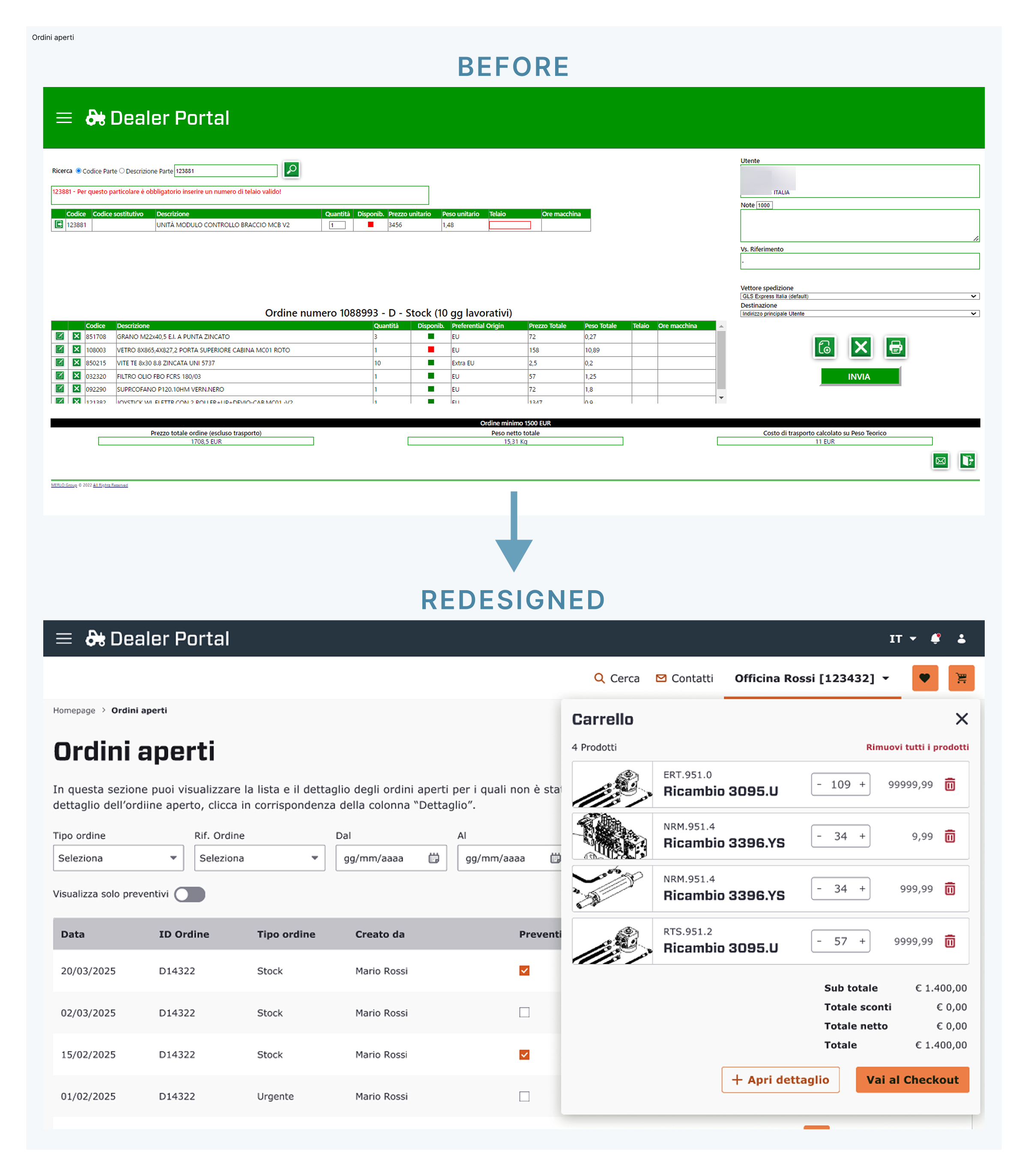
The "Before" version presented all data at once — filters, order details, and totals — creating a disorganised environment where users could struggle finding specific items. We opted for a solution that implied a progressive disclosure, by categorizing filters into clear, logical groups and separating the "Cart" view into a dedicated overlay, for the user's focus without losing context (and time).
The new interface ensures a high contrast ratio (WCAG 2.1 compliant) for text elements and UI components. We also improved the navigability of the portal by using clear labels instead of ambiguous icons, and provided extensive indication to the devs for implementing the correct keyboard navigation, including skip links and focus states.
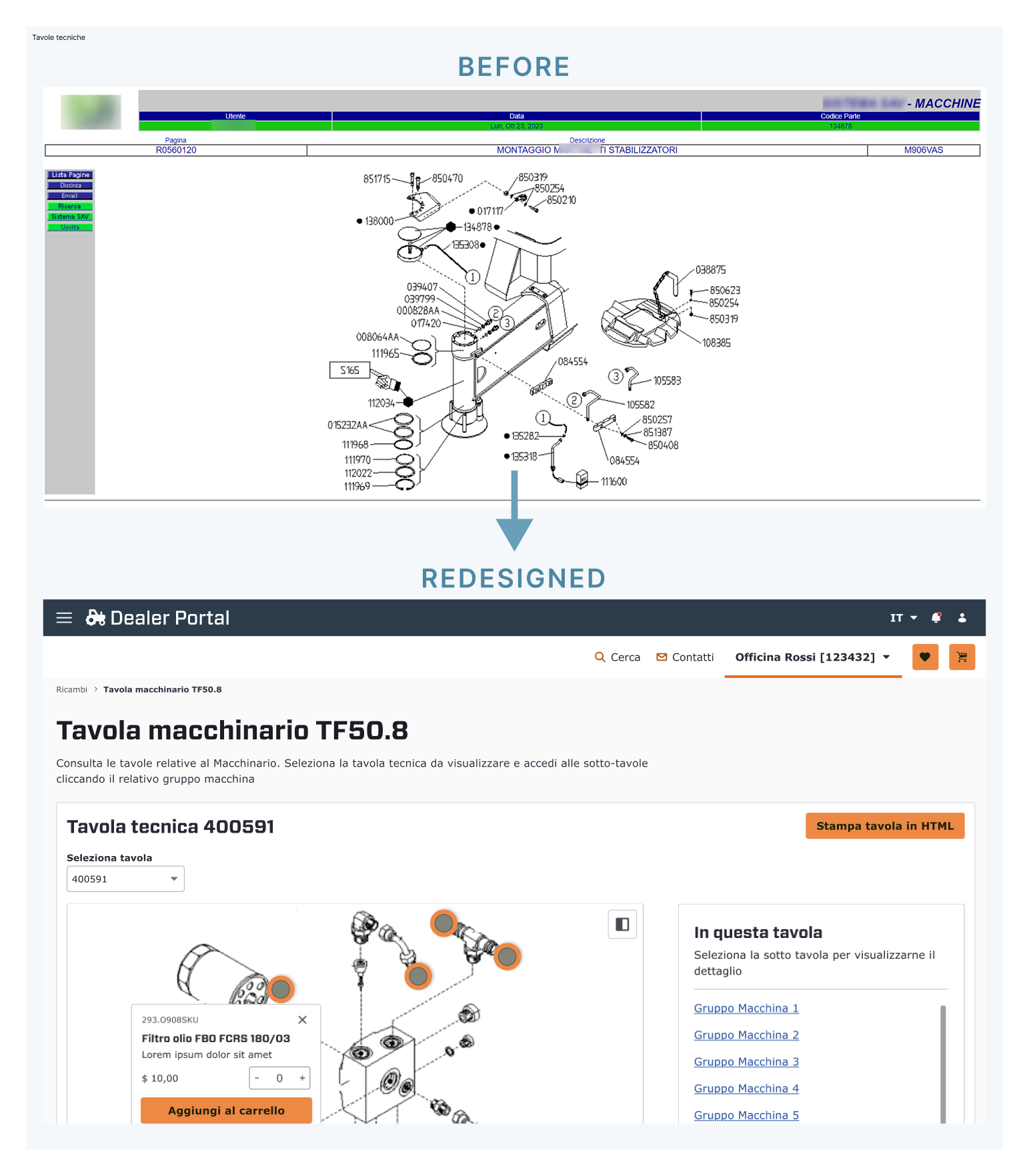
The "Before" view presents a static line drawing cluttered callouts. Users had to remember a number, then find it in a separate list. This info overload causes significant cognitive strain. I introduced an Exploded-View Diagram with interactive hotspots. This shifts the user from "finding" to "identifying." Each active part inside the board has a large, distinct orange marker.
In our new solution, the interactive hotspots in the technical board now trigger a Direct Manipulation Part Card. This contextual overlay provides a complete overview of the item: image, description, and price. The overlay card enables users to configure and purchase parts without leaving the diagram. The section "In this board" offers the complete list of all the components present on the technical board, thus adding an alternate navigation method and allowing users to quickly jump to the preferred item.
We created a clean version to establish a minimal design baseline First, we added delicate shadows which then were removed to stick to a modern flat design.
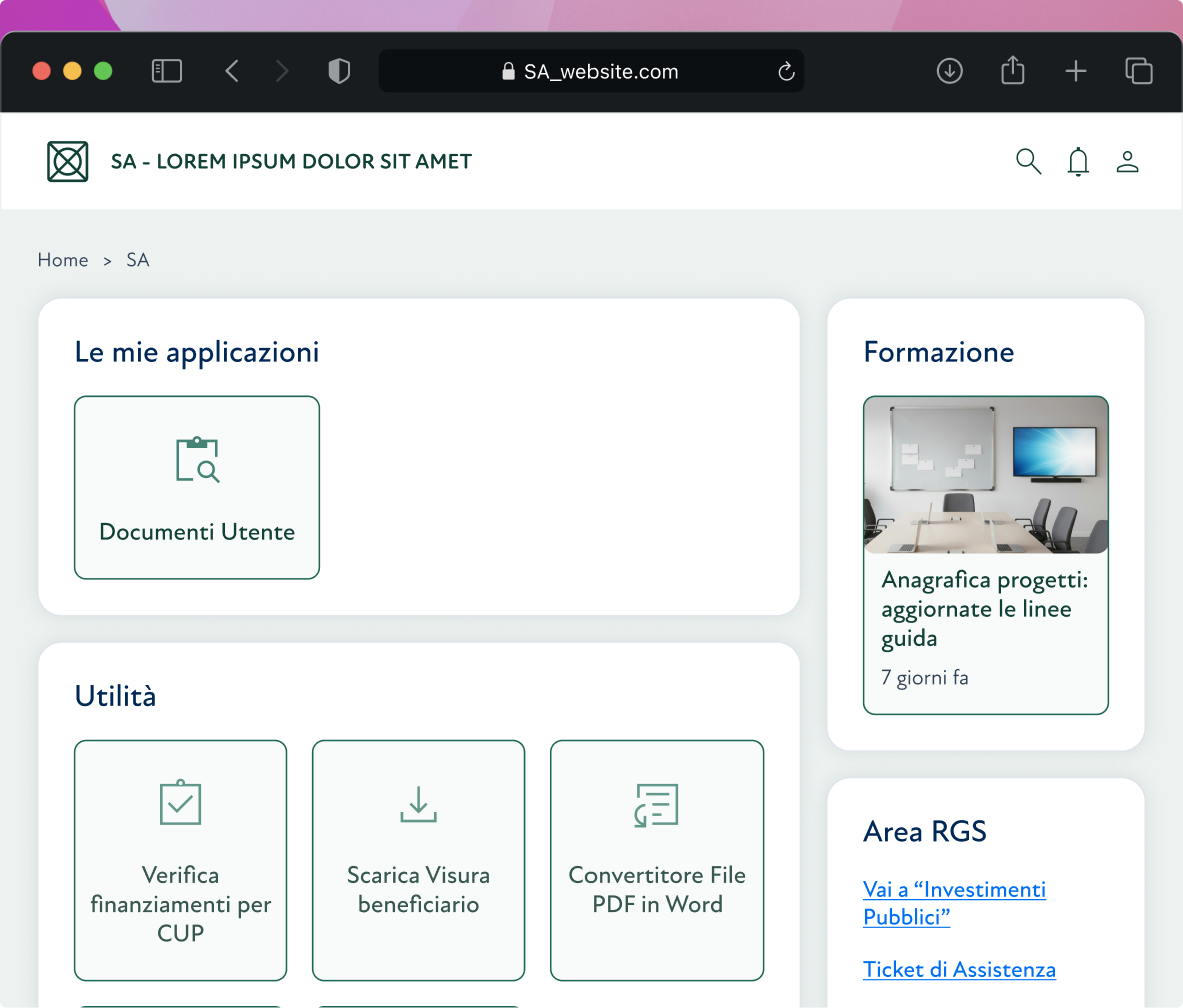
The widget layout was created to reduce the user's cognitive load by arranging functions into distinct macro-areas. This categorisation system allows for immediate visual scanning: the users quickly identify what they need, improving overall efficiency in daily navigation.